It's something...
cozy.nyc is an ongoing project Juan Jimenez,
Sophia Setsu, and I are working on.
The project has gone through two conceptual pivots. We initially wanted to
create an online buying and selling marketplace, but later changed strategy
when we realized there was an oversaturated market in this sphere. As a result of
this and shifting personal interests, we decided to instead create a platform
for creatives and fans alike to share and discuss projects. Soon, we realized
that this was too broad an idea for our small team to accomplish, and
re-conceptualized cozy.nyc as a livestream platform for NYC creatives.
You can read more about the road of failuresa on cozy on my blog
here.
New Goal
Our new goal with cozy.nyc is to build an open live streaming platform for NYC creatives to show finished work or the creative process.
Brand Design
Stay Cozy...
Why the name "cozy?" When we first started on the project (back when we planned it to be am e-commerce site), A$AP Mob's *Cozy Tapes* just came out.
Logo - Cubes

Designed by Byron Kim
Why a cube? We wanted to have a logo that could be converted to a physical
object, and a cube is a versatile and simple shape to reproduce using other
media.
The "C" on the side of the cube is a play on the fact that cozy's content
is consumed on digital boxes like computer monitors and phones.
Font - Dosis
Why Dosis? Dosis is a rounded, san-serif font. When considering how to give the site a warm, playful atmosphere, Dosis Extra Bold fits well and matches other design elements like our logo.
The Old Web Design
Users can post live streams from websites like Twitch, Youtube, and Instagram
to the directory and invite other users to the streaming platform's chat.
The goal is to have a community that can watch and discuss videos and streams
together as they're happening, without having to move around different websites.
Wireframes
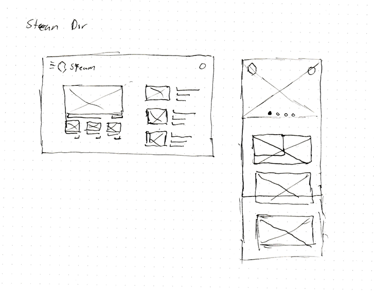
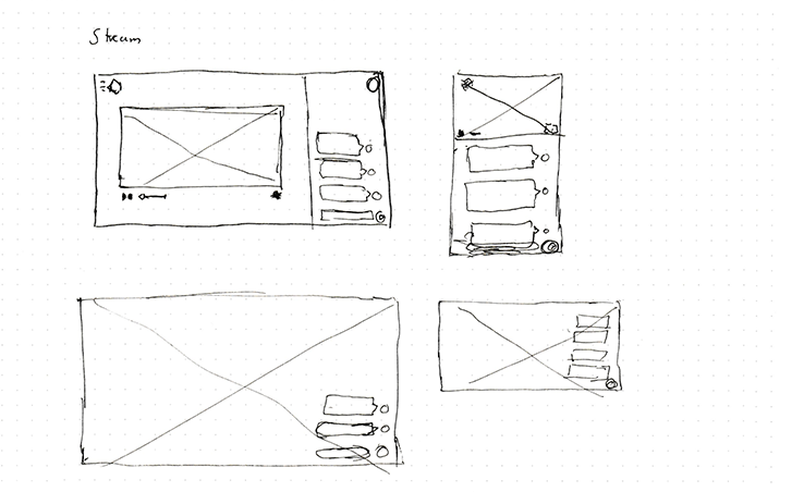
Old Design Mockups
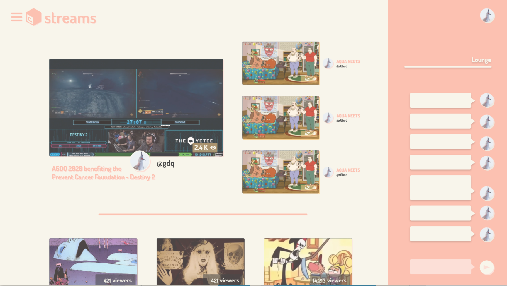
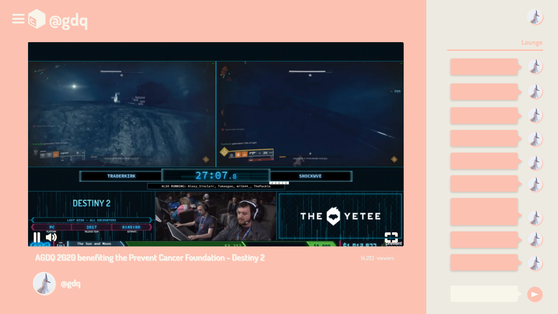
One issue with the original cozy.nyc designs was that I attempted to combine too many colors. While every section of the site, i.e. streams, boards, etc, had their own color theme, the themes themselves did not work so much with the content displayed and the goals of the application.
Since the team is focused on just the livestreaming features of the site the old design did not have to hold to the same color theme rules.
Redesign
Home Page
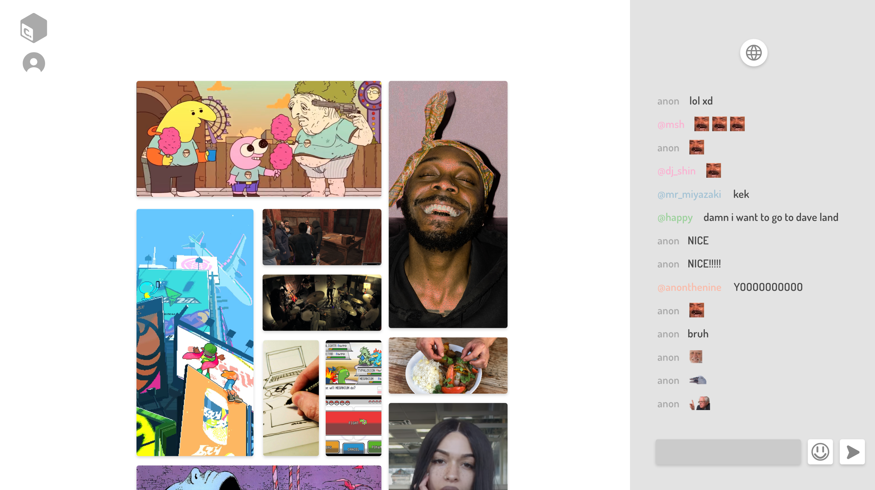
The homepage/stream directory is now focused on displaying all current streams at the ease of a scroll. A recent capture of the stream is displayed and info such as the name, user, and views of the view is hidden until hovered. This hopefully will put the content front and center rather than the views and whos hosting the stream.
The order and size of the stream preview is based on views for now until a better solution in order to get more people on to unheard artists is found.
Stream
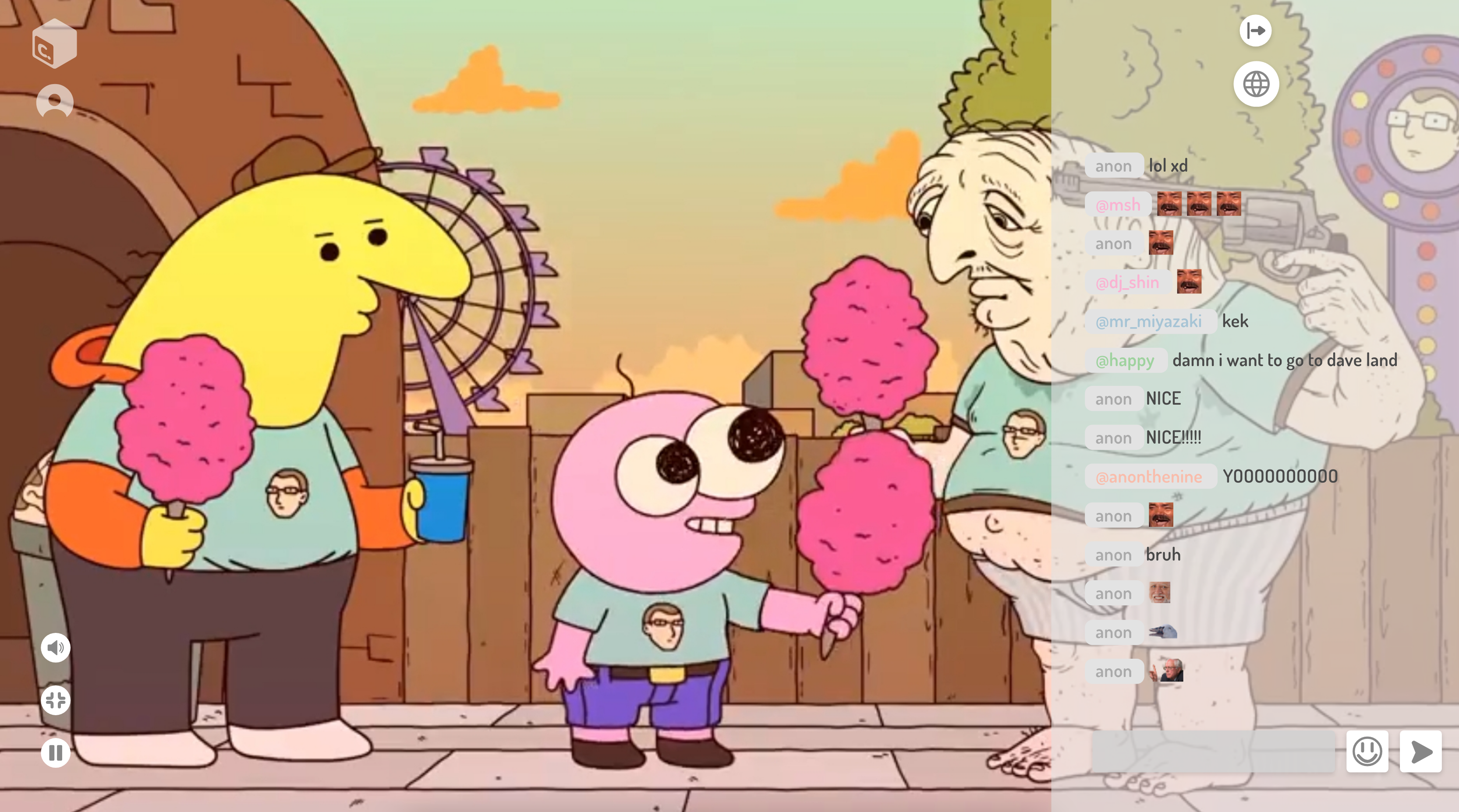
A global chat is still kept for a sense of community amongst the site. There's also a local/profile chat if a user allows it on their stream along with support for 3rd Party chats from other platforms the video stream is taking place.
A simple profile to get users on to other platforms to support artists. The goal is not trying to be the next big platform for artists. It's just a place to share content across a community big or small.
The Results
Currently rebuilding the site to the new design and goals. So stay tuned and join the team and community on discord at https://discord.gg/3WSA2SG!
