
New York Film and Music Foundation Website Redesign
A 4-Month UX/UI and Web Development Freelance Contract Job.
New York Film & Music Foundation is a nonprofit accelerator geared toward helping
artists find success. NYFMF goal is to help artists tell their stories to a
broader audience, and connect them to a community that appreciates the arts.
The Start
Understanding the Brand
New York Film & Music Foundation is a nonprofit accelerator geared towards helping artists find success. NYFMF's goal is to allow artists to share their stories and connect with a broader audience.
I began my work with NYFMF by hosting a workshop on basic design concepts, design thinking, market research, and brand identity. The purpose of this was twofold. Firstly, this would equip the team with the knowledge to keep building their branding and visual strategy independently. Secondly, it would build understanding as to why a redesign effort was needed, as the existing branding strategy was not cohesive.

Research
Two weeks before the workshop I asked the team to provide websites that they like the visual and functional aesthetics of from the nonprofit and music/media sectors. During the kickoff meeting I presented a few of these websites and a couple of websites of my own choosing and ran an exercise on what aspects of the website did they like and dislike.

Previous Brand
I interviewed the members of the organization on their feelings toward current brand, particularly the logo.
Through these interviews, I found that a number of people found the logo difficult to read and confusing, making it a significant pain point and a good starting point in the redesign effort.
Previous Site
Through these user interviews, I discovered that the non-development team found it difficult to add or change information on the page, making it a significant hindrance to update the artist roster, for instance. However, the website's tech stack (Express.js and Jade) did make it easier to code for a developer, meaning this would be a tradeoff we would have to weigh.
Additionally, I found that the single-page layout was not the friendliest to an end user, as the page showcased a significant amount of information that was overwhelming put on a singular page and required a significant amount of scrolling to get through.
The Process
Wireframes
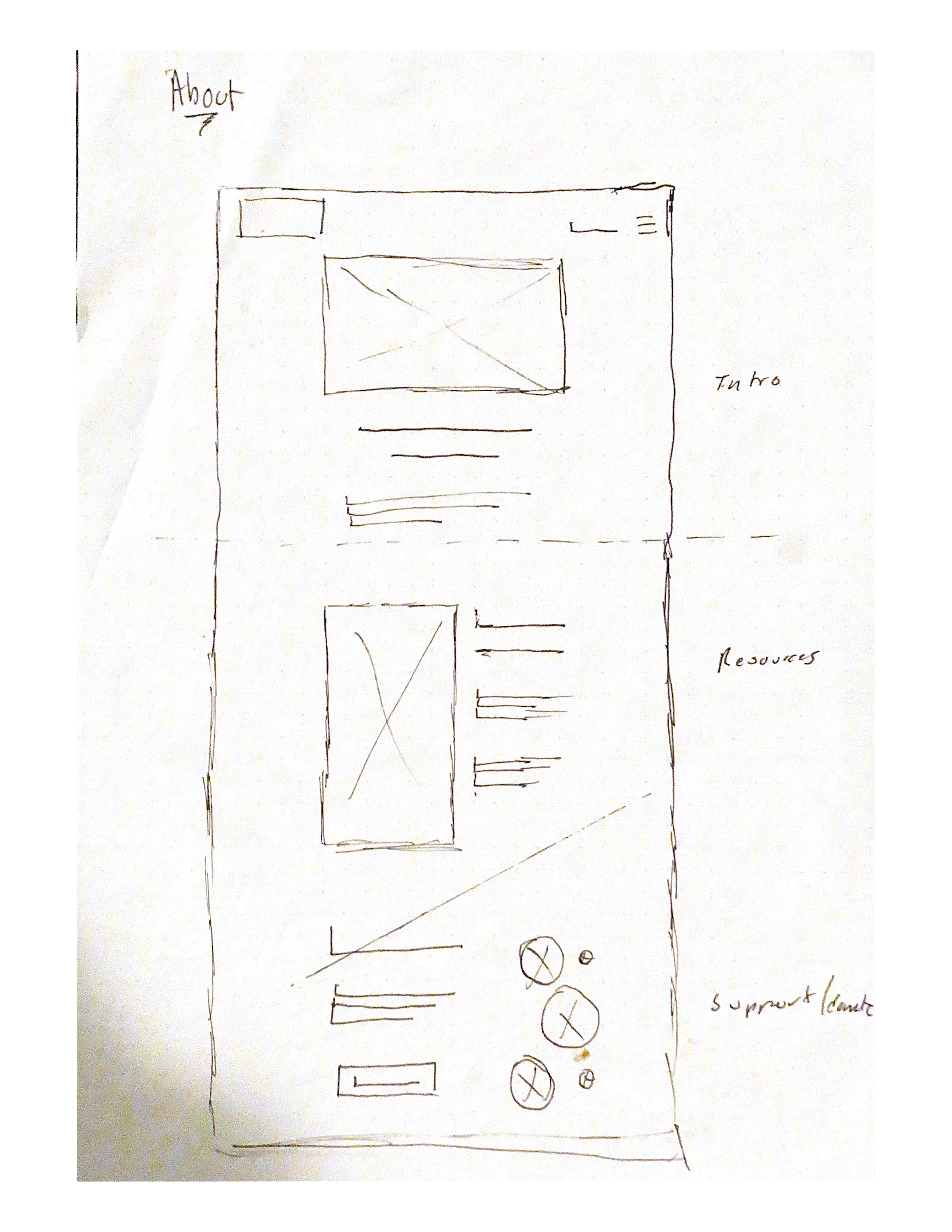
Due to time constraints, I dove straight into the design/brand identity creation process after making the initial wireframes. This is definitely not something I'd ideally like to do--I normally create numerous drafts and iterate to improve those designs based on client feedback.
The Results
Brand Redesign
Logo
While designing the new logo, I kept in mind the brand attributes we had come up with in the initial meeting. This the new Logo instills a feeling of "Modern" and "Established," and uses the type Lemon Milk by Marsnev.
The logo was kept greyscale to render well and consistently across different media like film, print, and web. The use of different shades of gray kept the logo feeling dynamic and modern.
Above is a concept of how the logo can be used in promotional material. These design concept was inspired by the MTV logo, where a logo can be manipulated but still be immediately recognizable as the logo."
Color
When discussing colors with the team, I came to the conclusion that keeping black and white allows for the images and film to breathe more without worry of clash.
Typography
Lemon Milk - Logo
Neue Haas Unica W1G - Headings
Cooper Hewitt - Body
I chose three fonts for the visual strategy, wanting to keep things simple. A sans serif font was chosen for a more youthful feel, reflecting the artists the foundation represents.
Website Redesign
Homepage displays the most recent Deep Dive Sessions on the top via a carousel, which are "blog post"/articles about an Artist involved in NYFMF. The homepage design accomplishes the same needed info about the organization in a cleaner format while also leading towards other pages on the site for more details.

In the original wireframes, I had a place for artist content. Instead I opted for having links to external sites for artist content. Since the organization isn't a publishing company and all the artists that are supported are creating and publishing on their own, it would be easy for development and for the artists to have users of the site go to their Youtube channels or Soundcloud profiles. This way we wouldn't need to build a publishing platform on the site.
An actual donation page. In terms of the rest of the donation process, i.e. name and email, that's to be planned once the choice of donation platform is solidified.