
Introduction
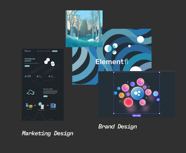
Element Finance is a protocol for fixed and variable yield markets. It is a decentralized finance (DeFi) protocol that allows users to deposit assets and earn interest on their deposits. The protocol is built on the Ethereum blockchain and is governed by the Element DAO.
I was brought on to Element as a Design Systems Designer to build out the
new design system for the Element Finance v2 DAPP and the web3 community
over all. My position grew to also ideate on the new branding for Element
DAO, Element Foundation, and [REDACTED].
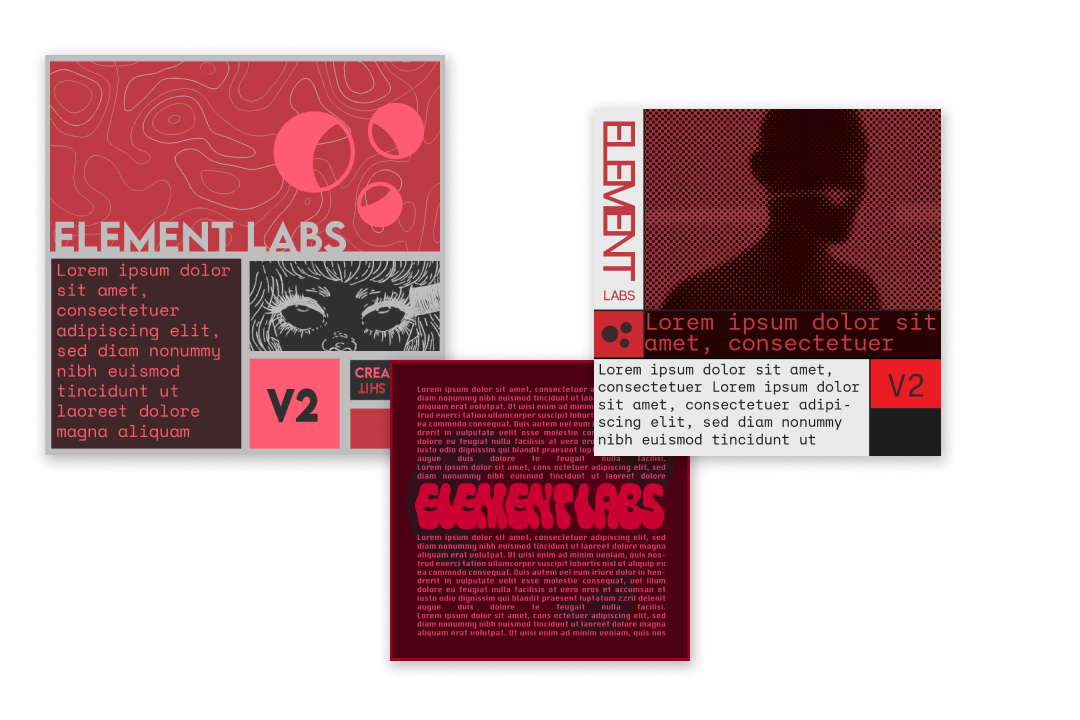
Re-Branding
Goals
To create a concise and clear communication of the effects of the governance
launch, and the three entities that is Element. Building a distinction
between the R&D arm [REDACTED], the Foundation and DAO, as the team
innovates and build V2.
Communicating a more clean, modern, and minimalist look that conserves the current logo and some elements of the current branding.
Old Branding
Moodboard

As for any branding project, we started with a moodboard drawing from a wide range of different media.
Story
A goal early on for the new Brand was to have a connected lore/story to the older brand. We came up with the narrative that everyone(i.e. the users) wake up in a laboratory similar to Oz Corp. "The world of elves (the previous NFT project/branding) was all just a simulation." In this universe the world is governed by 3 elemental forces.
Concepts
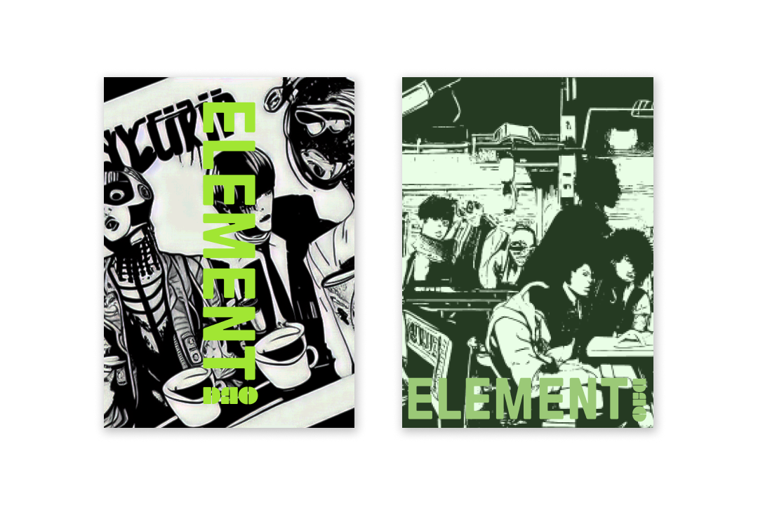
[REDACTED]
Based on the elemental/alchemical Force of Fire. The
[REDACTED] entity was design to present the ethos of break stuff
and make stuff. Embracing the anonymous collective of the team to build
and experiment. The concept of outer worldly, anonymous, and ghostly
combined with the mad scientist in their lab.
Element DAO
Like the alchemical element of Earth, the DAO represents the foundation and lifeblood for the Element Protocol. Inspired from video games and retro computing, the concept for the DAO's branding was to establish the community in cyberpunk city.
Element Foundation
The Element of Water represents knowledge in western alchemy. The
Foundation is the legal owner of Elements IP and the contracted
[REDACTED] and other entities to work on the Element Protocol.
Design System
The goal for the design system was to set an industry standard. It can serve as an educational tool and reference for junior-level designers and content contributors in crypto. Explicitly written design systems that span across products, channels and departments aid those who are new to design in our industry and also serve as a reminder for the rest of the contributors.
Inspo
The visual aesthetic for the design system is a call back to early computing/tech. As well as pulling inspo from 50's/60's graphic design.
Guidelines
Rules and suggestions are sometimes more important than the values presented for a design system. Making sure that fellow designers and developers can understand how to use the given text, colors, spacing, etc will help keep designs constant across different pages and applications.
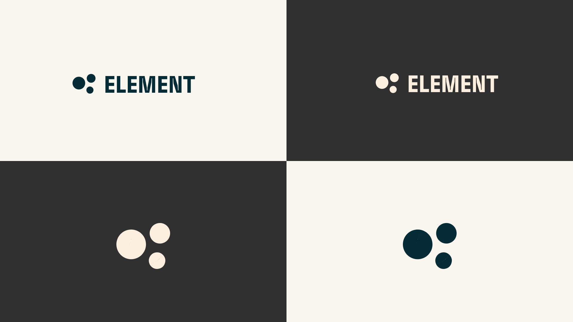
Color
The colors where inspired by alchemy manuscripts primarily "Splendor Solis" by Salomon Trismosin. Each of the colors are named after an alchemical reagent or element. Such as Element Salt for White and Element Mercurius for Red.

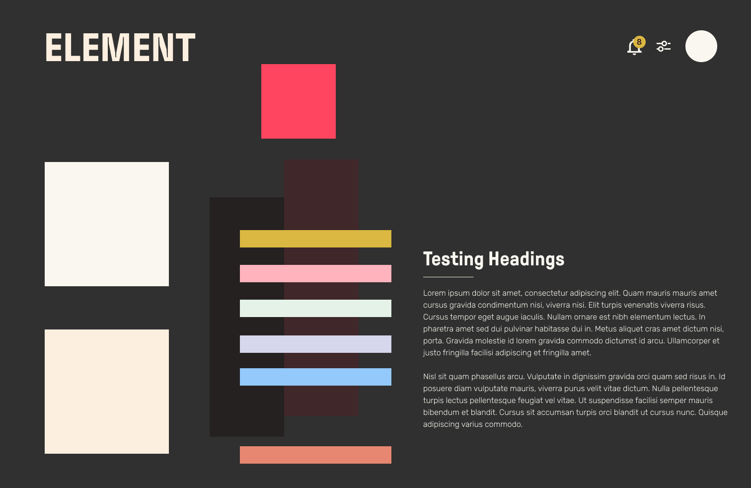
Color Blocked
Each of the colors chosen for the theme are at least AA WCAG compliant as long as they used for their intended roles. So all Accent, Text, and State colors have a strong contrast will all available Foreground and Background options for their respective theme.
All colors have been tested per theme to make sure they look good anywhere they are meant to be applied!
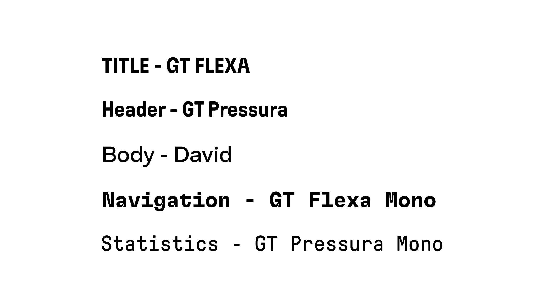
Typography
The Base body text size (16px) is 1rem. So the next step up to LG(18px) is 1.25rem and a step-down (14px) would be 0.75rem. This scaling also applies to all text accross the system.
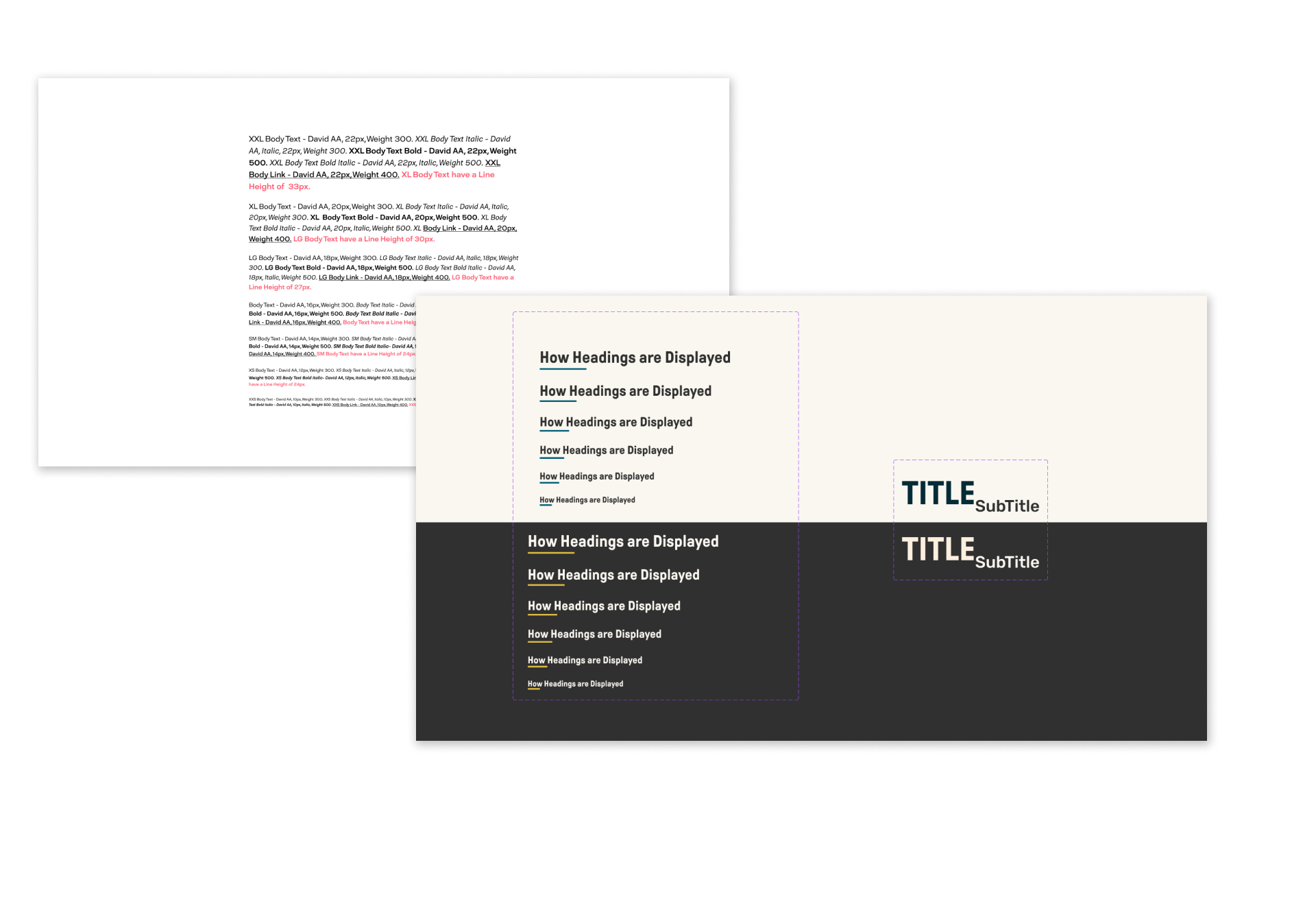
Headings use the Primary Text color and should have a line that's 1px width and 100px length. The line rest at the bottom of the heading. To make sure there's always strong visual contrast between the body text and the heading above, especially when using smaller headings such as Heading 6, as shown above, were the text size is the same as the body.
Components
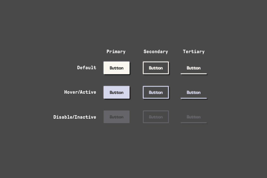
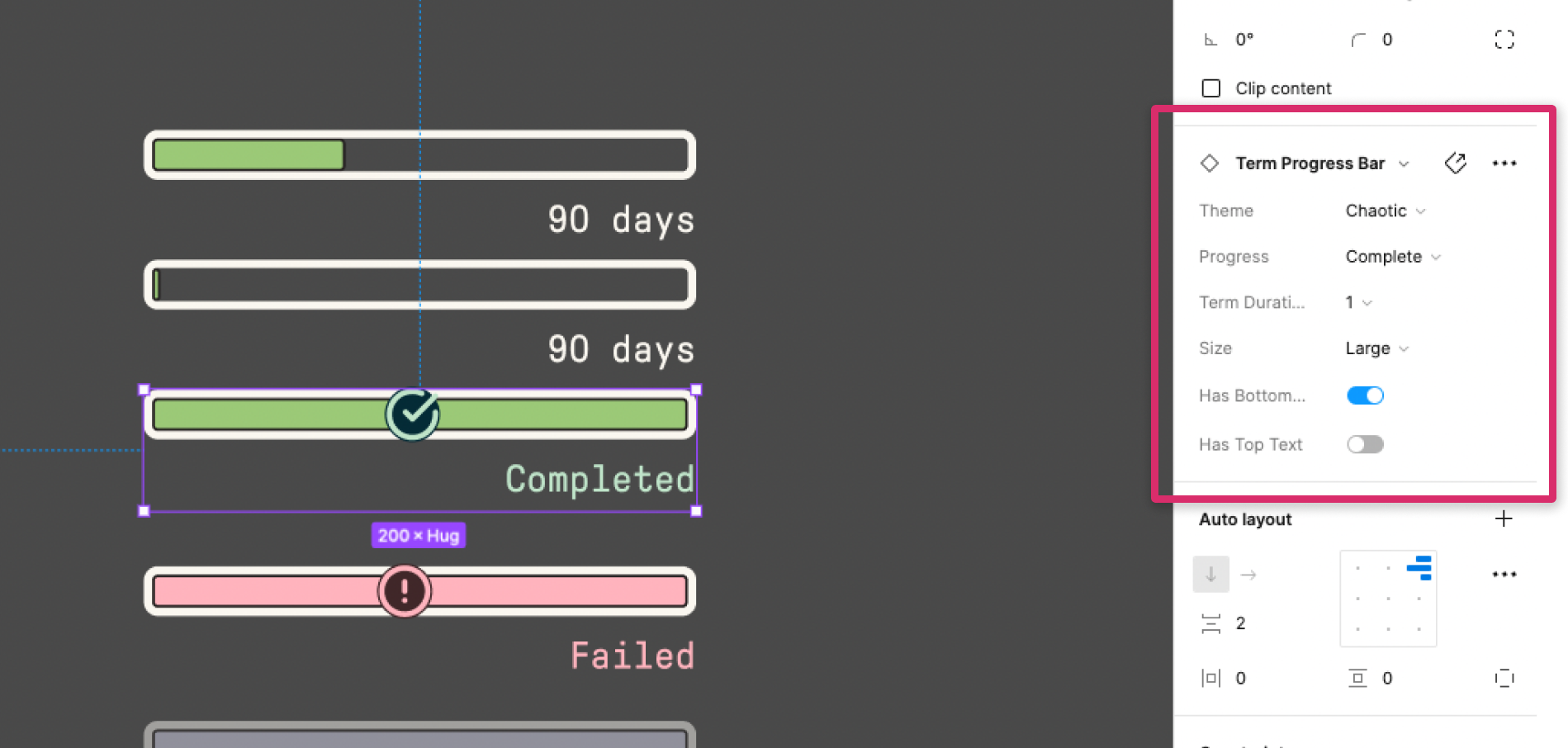
The components had to be easy, varied, and composable for the other designers on the team. The designers can basically drag and drop then flip some switches to get the style, color, and size for components in a fly. The system made it so our UI designer can rapidly and reliably create and change pages faster and with high quality. Figma's component system is a great tool for this. It allows for crazy amount of properties and inputs as long as it was design right from the start.
Figma's auto layout feature is a must-use for any components. This way scaling basically is a non factor and makes it really easy for frontend developers to translate it to code.
UI
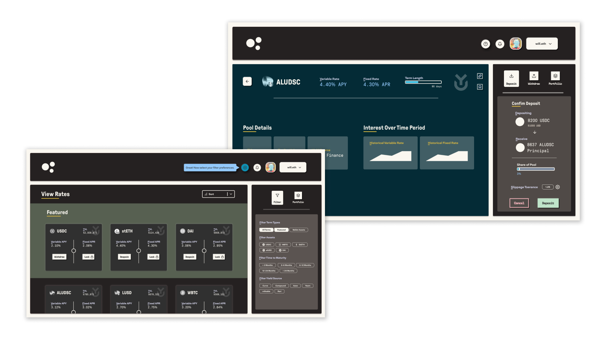
I guess now it's probably the time to talk about V2... Element V1 solely offers fixed rates positions. In V2 we were creating an incentive system, and positioning ourselves as a yield protocol with variable rate products, leveraged rate products and colaterization and want to create a design system that visually communicates this experimentation and innovation.
Breaking The System!
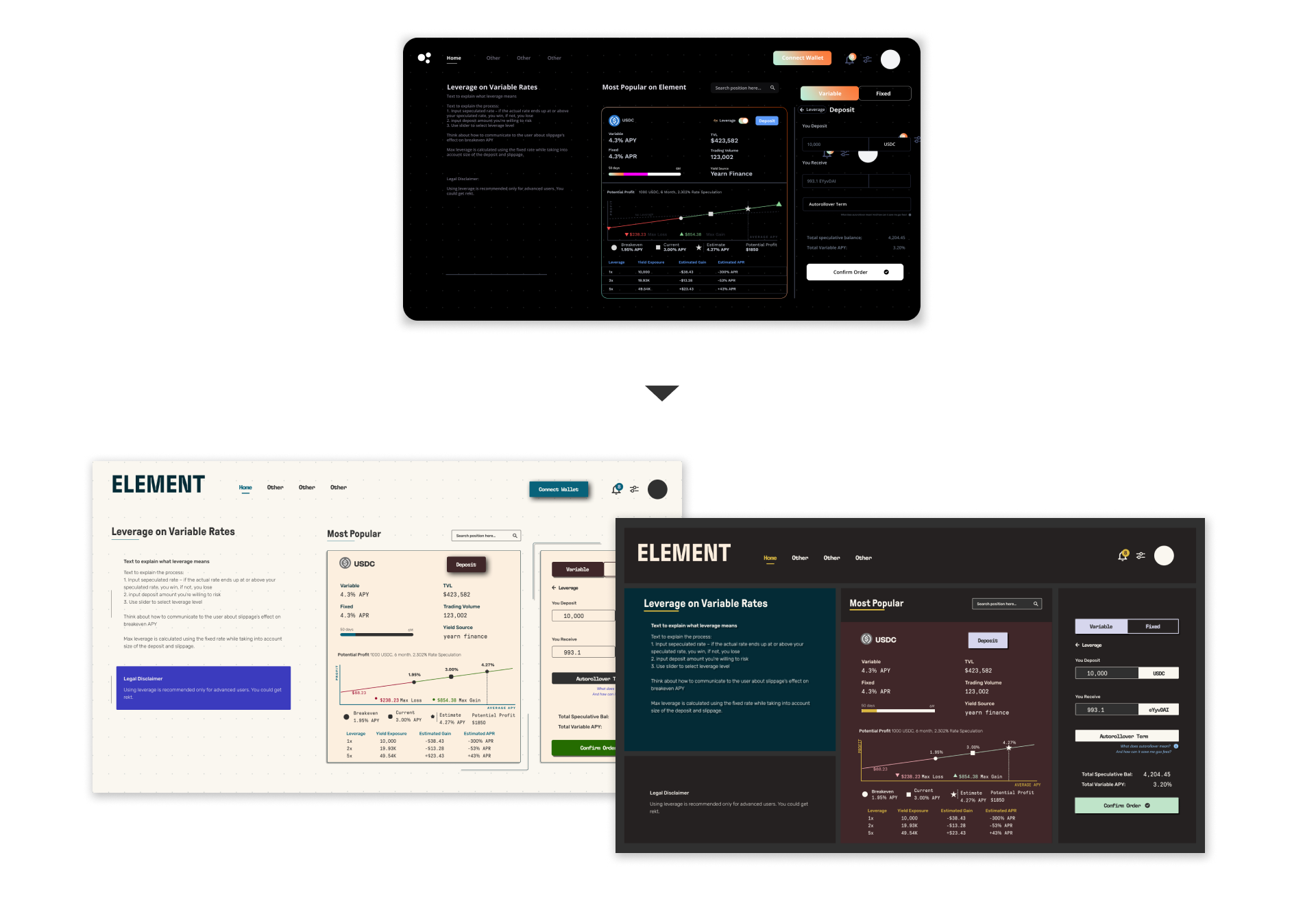
While I was mainly working on the design system, I was important to me to work on the UI mockups to test out the components and design Guidelines to see if I need to make any changes to the rules written or any redesigns to make sure everything works together.
New User Experience
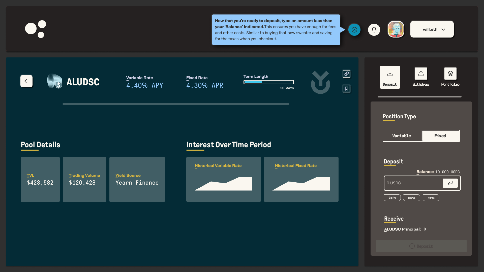
About the new user experience/education flow. How can we bring a non crypto users into defi. Will add a video/gif of the New User Flow!
Postmortem
Even though my stay at Element was short is it was one of the best experiences I've had as a Designer. I was given space to actually have room to be creative and try new things. Also, just being able to work with a great team of extremely talented and smart people who were all very passionate about what they were doing. Shout out to Tina! Best Boss Ever!
An aspect of the work I regret is not putting enough time into looking into more up incoming dapps/defi apps in the space. This would have helped to stand out in a sea of new defi protocols. While the designs were unique compared to dapps that we're already establish, I guess I was following a trend in design without realizing it.
Another issue was with the branding. I rushed in to making concepts without the proper research and planning. I should have taken more time to talk to shareholders and members of element to get a better feel of what they want/view Element as. In full honesty I wasn't excepting the stakeholders and the rest of the team to even take the concepts. Those designs were me playing around with ideas discussed in our design team brand ideation meetings.